

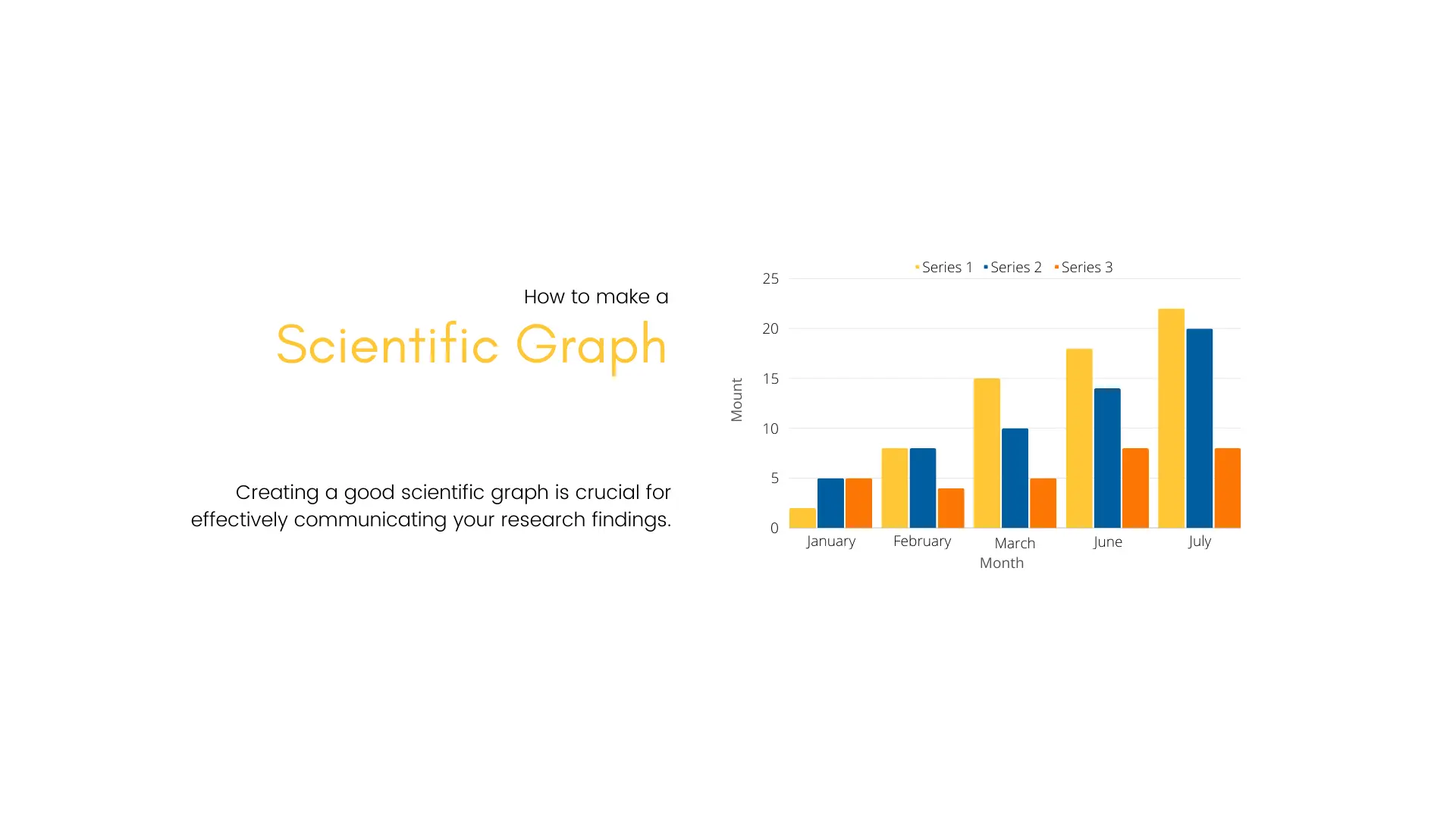
Creating a good scientific graph is crucial for effectively communicating your research findings. Here are specific tips tailored to scientific graphs:
- Choose the right graph type. Select a graph type that is appropriate for your data. Common types include line graphs, bar charts, scatter plots, and histograms.
- Label axes clearly. Include clear and concise labels for both the x-axis and y-axis. Include units of measurement. If applicable, mention the variable and its unit in parentheses (e.g., Time (s), Concentration (mol/L)).
- Use consistent formatting. Maintain consistency in font size, style, and color. This enhances the overall professional appearance of the graph.
- Include a descriptive title. Provide a title that clearly communicates the main message or purpose of the graph. Be specific and concise.
- Highlight data points appropriately. Use markers or data points that are easily distinguishable. Employ colors or shapes to differentiate between different groups or conditions.
- Provide error bars. If applicable, include error bars to represent the variability or uncertainty in your data. Clearly explain what the error bars represent in the figure legend.
- Scale axes appropriately. Choose scales that make it easy to interpret the data. Be mindful of the range and granularity of your data. Avoid misleading visualizations by starting axes at zero.
- Use gridlines judiciously. Gridlines can aid in reading values, but excessive gridlines can clutter the graph. Use them judiciously. Consider using a lighter color or dashed lines for gridlines.
- Include legends or labels. If presenting multiple data series or groups, include a legend or labels to clarify which line or bar corresponds to each. Ensure that the legend or labels do not obstruct the graph.
- Consider logarithmic scales. For data that spans several orders of magnitude, logarithmic scales on one or both axes may be appropriate.
- Avoid 3D effects. In general, avoid using 3D effects or perspective unless they genuinely add clarity. They can distort data and make interpretation challenging.
- Clarify statistical significance. If your data includes statistical tests, use appropriate symbols (e.g., asterisks) or lines to indicate significance levels. Clearly state the significance level in the figure legend.
- Provide adequate white space. Ensure that there is sufficient white space around the graph to prevent crowding. This enhances readability.
- Incorporate figure legends. Include a figure legend that explains any abbreviations, symbols, or additional information necessary for understanding the graph.
- High-quality graphics. When exporting or saving your graph, choose high-resolution formats to maintain image quality when printed or displayed.
- Accessibility considerations. Make sure your graph is accessible. Use patterns or textures in addition to color to convey information and provide alternative text for readers with visual impairments.
- Peer Review. Before finalizing your graph, consider seeking input from colleagues or peers. Fresh eyes can identify potential issues or areas for improvement.
By following these guidelines, you’ll enhance the clarity and effectiveness of your scientific graph, aiding both your own understanding and the comprehension of your audience.